山村訓長但知覓
The Sanchon Hunjang(usually clicking on the photos yields an enlarged version)
10/05/2005
Wholly cursive writing, Batman
Most people who care already know that there are five major faces of Chinese calligraphy, and countless variations within each of those. The five biggies are 篆書 zhuanshu 전서 "seal writing", 隸書 lishu 예서 "clerical script", 楷書 kaishu 해서 "regular script" or "square script", 行書 xingshu 행서 "cursive script" or "running script" and the even more cursive and abbreviated 草書 caoshu 초서 "grass script". Not surprisingly each has its own rules about how to make it asthetically pleasing.
☞ 篆: 전자 전, 書: 글 서, 隸: 종 례, 楷: 본 해, 行: 갈 행, 草: 풀 초.
Not long ago the Sanchon Hunjang was going somewhere on the subway and in no particular hurry. There were some elderly gentlemen who had pasted samples of their calligraphy all over the inside of the subway station. They also posted a sign that read "가훈 써드립니다" and were busy practing the art of the brush. Not being in a hurry, I stopped to look over their work. One of the gentlemen noticed the Sanchon Hunjang perusing their works and escorted me to a piece, a short poem in 행서, that was framed especially nicely. He beamed as he explained how his good friend, who was not there at the time, had written this one and had been awarded a prize for it in some competition.
The calligraphy was impressive, and at the same time, it wasn't. It seems that this man had won his award in a pretty small competition. Unfortunately I didn't think to snap a picture of it at the time, but I have located a graphic on the internet that captures the essence:
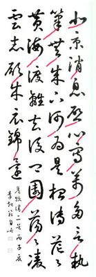
Looking at the individual words, each each is executed very well. The artist had enviable control over his brush. The problem is that, with 행서 or 초서, there is supposed to be a rythmic flow. The characters are supposed to flow into each other, or at the very least, those little "tails" on the end of each character are supposed to point to the beginning spot on the following character.
As you can see in the red extensions to those tails, that I've taken the liberty of adding, this artist (and the gentleman whose friend I met) was writing a bunch of characters as opposed to a complete work that happens to be made up of individual characters. Most of the tails just point into empty space, rather than tying each into the whole. I wasn't there, but it feels as if he wrote one character, took a short break and then moved on to the next. Each one is nicely executed, but there is no sense of an integrated whole.
Here is how 행/초서 is supposed to look:
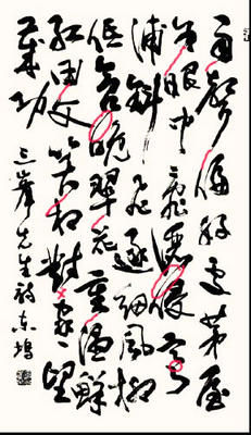
Again, I've taken the liberty of highlighting. Each word leads into the next, so you can see the flow. It is obvious that this artist had a complete work of art in mind from beginning to end.
Real calligraphers have this sense of complete work in mind when they pick up the brush to write something. This is why the professional calligraphers all got up-in-arms when talk emerged of replacing the signboard of 광화문, currently in 박정희's hand, with one made up of the three characters 光, 化 and 門 culled from the actual writing of King ChOngjo. Because, when you pick three characters that were not planned to be next to each other when they were written ("集字 집자"), they don't come together and make a work of art that feels complete. The option that they just elect one famous calligrapher to represent the country and write it was even more unpalatable. And the 한글 lovers all got up in arms, too, because this all meant stepping away from the beautiful script of Korea, not to mention writing it backwards. I haven't heard whether they really went ahead with the plan to replace the sign on August 15 this year. I'll have to use the excuse of checking to make another trip downtown.
☞ 光: 빛 광, 化: 변화 화, 門: 문 문, 集: 모을 집, 字: 글자 자.
The Sanchon Hunjang has to admit to dabbling in a bit of 집자, unfortunately. I wanted a ring with my name in cursive Chinese on it. But, not knowing anyone with the skill or inclination to pull it off, I just picked the 초서 samples of those three characters from my 옥편. I didn't realize it then, but the writing on that ring does lack something.
And, speaking of 집자 and lacking something...

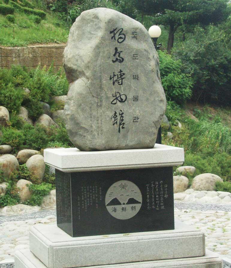
I'm not sure who, if anyone, they got to do the writing for this stone, the name-stone for the 독도박물관 on 울릉도, but you notice it has the same disease. Each character executed very nicely, but no sense of whole. No linkage between the words. I wonder if they didn't do an 옥편 집자 job on this one.
☞ 篆: 전자 전, 書: 글 서, 隸: 종 례, 楷: 본 해, 行: 갈 행, 草: 풀 초.
Not long ago the Sanchon Hunjang was going somewhere on the subway and in no particular hurry. There were some elderly gentlemen who had pasted samples of their calligraphy all over the inside of the subway station. They also posted a sign that read "가훈 써드립니다" and were busy practing the art of the brush. Not being in a hurry, I stopped to look over their work. One of the gentlemen noticed the Sanchon Hunjang perusing their works and escorted me to a piece, a short poem in 행서, that was framed especially nicely. He beamed as he explained how his good friend, who was not there at the time, had written this one and had been awarded a prize for it in some competition.
The calligraphy was impressive, and at the same time, it wasn't. It seems that this man had won his award in a pretty small competition. Unfortunately I didn't think to snap a picture of it at the time, but I have located a graphic on the internet that captures the essence:
Looking at the individual words, each each is executed very well. The artist had enviable control over his brush. The problem is that, with 행서 or 초서, there is supposed to be a rythmic flow. The characters are supposed to flow into each other, or at the very least, those little "tails" on the end of each character are supposed to point to the beginning spot on the following character.
As you can see in the red extensions to those tails, that I've taken the liberty of adding, this artist (and the gentleman whose friend I met) was writing a bunch of characters as opposed to a complete work that happens to be made up of individual characters. Most of the tails just point into empty space, rather than tying each into the whole. I wasn't there, but it feels as if he wrote one character, took a short break and then moved on to the next. Each one is nicely executed, but there is no sense of an integrated whole.
Here is how 행/초서 is supposed to look:
Again, I've taken the liberty of highlighting. Each word leads into the next, so you can see the flow. It is obvious that this artist had a complete work of art in mind from beginning to end.
Real calligraphers have this sense of complete work in mind when they pick up the brush to write something. This is why the professional calligraphers all got up-in-arms when talk emerged of replacing the signboard of 광화문, currently in 박정희's hand, with one made up of the three characters 光, 化 and 門 culled from the actual writing of King ChOngjo. Because, when you pick three characters that were not planned to be next to each other when they were written ("集字 집자"), they don't come together and make a work of art that feels complete. The option that they just elect one famous calligrapher to represent the country and write it was even more unpalatable. And the 한글 lovers all got up in arms, too, because this all meant stepping away from the beautiful script of Korea, not to mention writing it backwards. I haven't heard whether they really went ahead with the plan to replace the sign on August 15 this year. I'll have to use the excuse of checking to make another trip downtown.
☞ 光: 빛 광, 化: 변화 화, 門: 문 문, 集: 모을 집, 字: 글자 자.
The Sanchon Hunjang has to admit to dabbling in a bit of 집자, unfortunately. I wanted a ring with my name in cursive Chinese on it. But, not knowing anyone with the skill or inclination to pull it off, I just picked the 초서 samples of those three characters from my 옥편. I didn't realize it then, but the writing on that ring does lack something.
And, speaking of 집자 and lacking something...
I'm not sure who, if anyone, they got to do the writing for this stone, the name-stone for the 독도박물관 on 울릉도, but you notice it has the same disease. Each character executed very nicely, but no sense of whole. No linkage between the words. I wonder if they didn't do an 옥편 집자 job on this one.
Archives
7월 2005 8월 2005 9월 2005 10월 2005 11월 2005 12월 2005 1월 2006 2월 2006 3월 2006 7월 2006 8월 2006 10월 2006 4월 2007 5월 2007 6월 2007 7월 2007 8월 2007 9월 2007 10월 2007 11월 2007 12월 2007 1월 2008 5월 2008 8월 2008
![]()